The brief
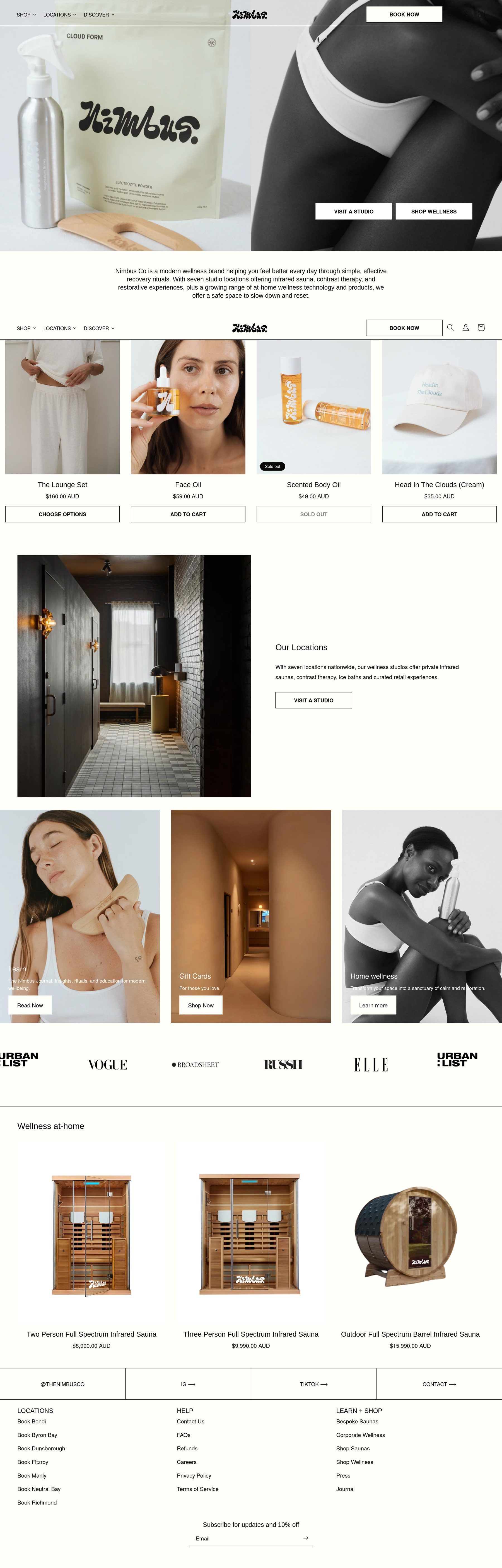
Nimbus had grown into several businesses at once: studio locations, a menu of treatments and a growing range of products for home.
The old site asked customers to understand the whole business before they could do anything. Someone wanting a sauna session and someone wanting to buy a product had to dig through the same pages.
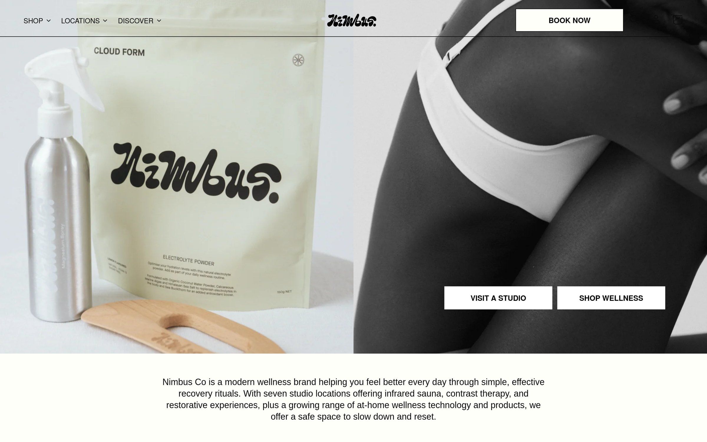
The redesign needed to give every visitor a direct next step, without losing the calm that defines the brand.
What we did
- 01
Two front doors
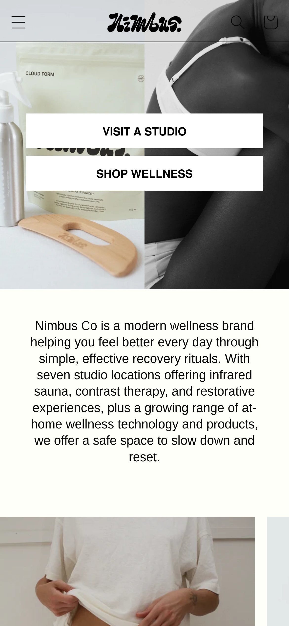
'Visit a studio' and 'Shop wellness' split the site at the very top, so the two main journeys never compete.
- 02
Locations that do the work
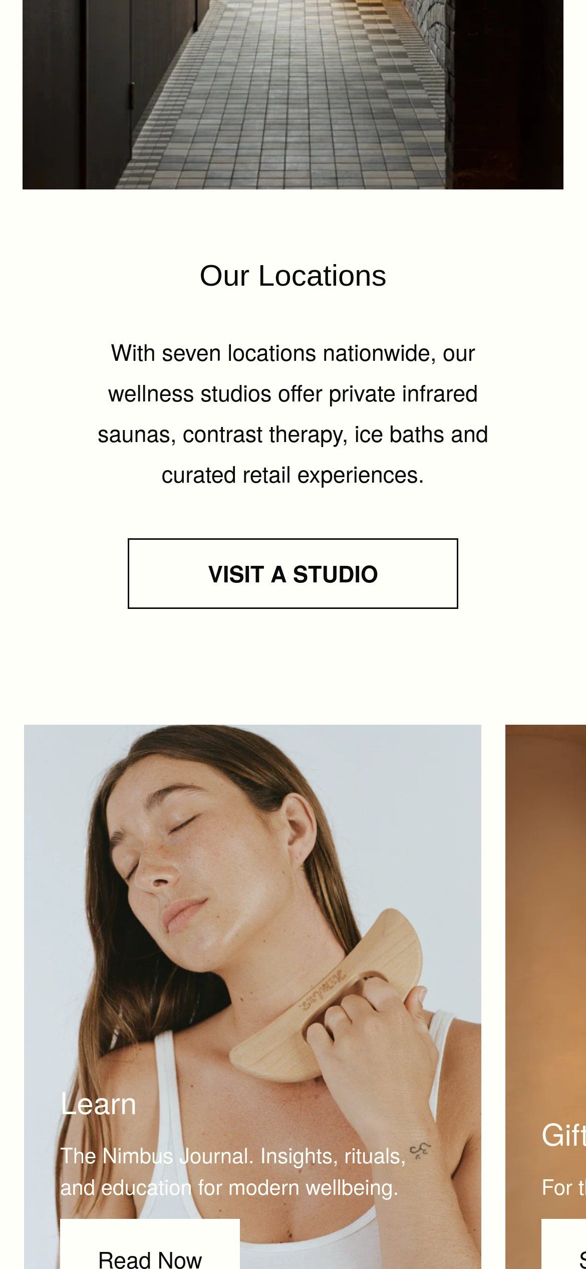
Each studio gets a clear page with treatments and booking, reachable in one tap from anywhere.
- 03
Products linked to rituals
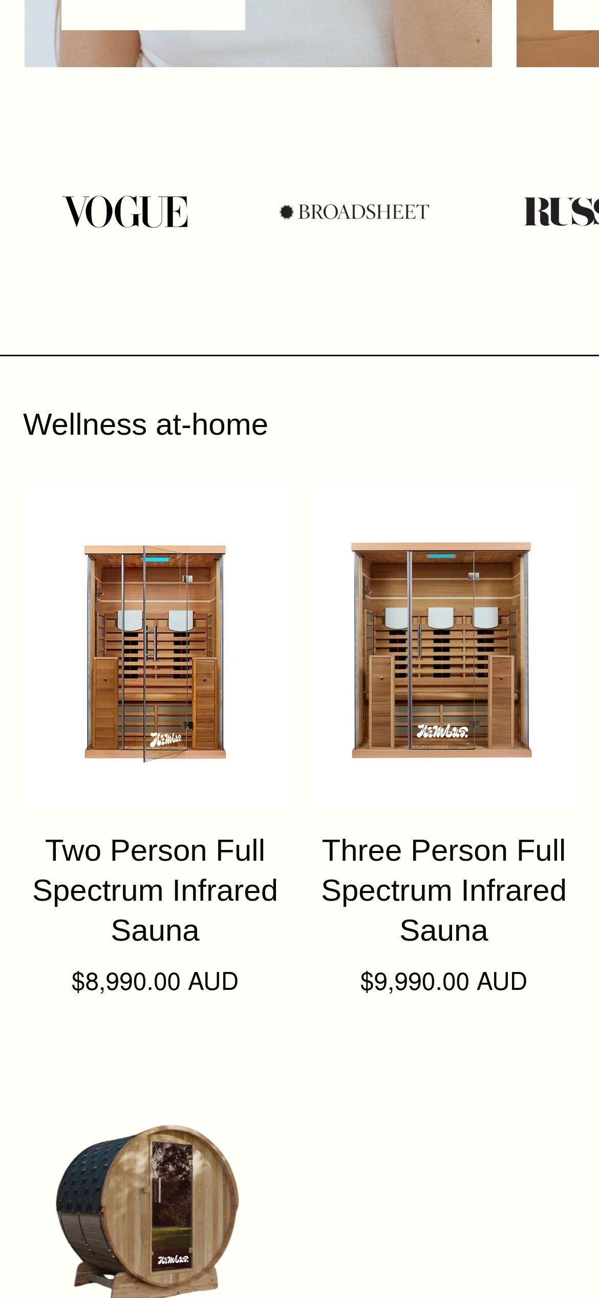
At-home products connect back to the treatments they support, making the store feel like part of the experience.
- 04
Quiet by design
A restrained palette, black-and-white photography and generous space keep the site as calm as the studios.
Outcome
Visitors now choose a studio, understand a treatment or shop for home in a couple of clicks, and the brand feels as unhurried online as it does in person.