The brief
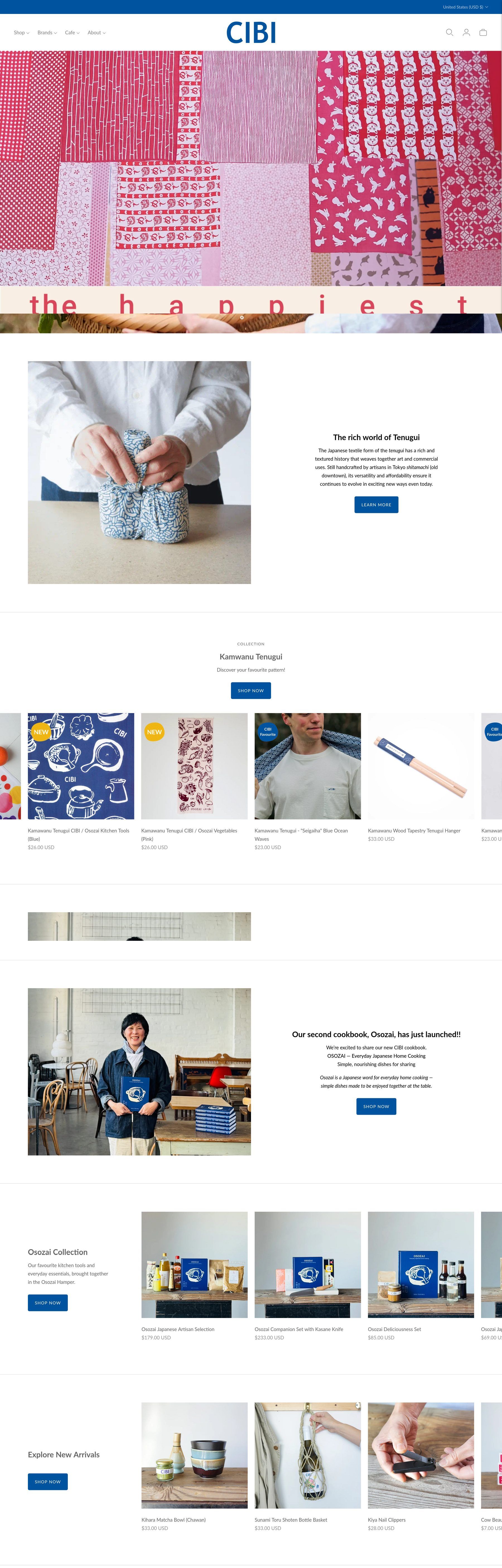
CIBI is a café, a Japanese grocer, a design store and a publisher, all under one roof. The old website didn't do any of them justice.
The previous site was slow, didn't render properly on phones and felt far less considered than the store itself. For a business built on beautiful, well-chosen things, that gap mattered.
The brief was to make the site feel like walking into CIBI: warm, curious and easy to move around.

What we did
- 01
One doorway, many rooms
Shop, brands, café and story each keep their own character, but share one navigation and one visual language.
- 02
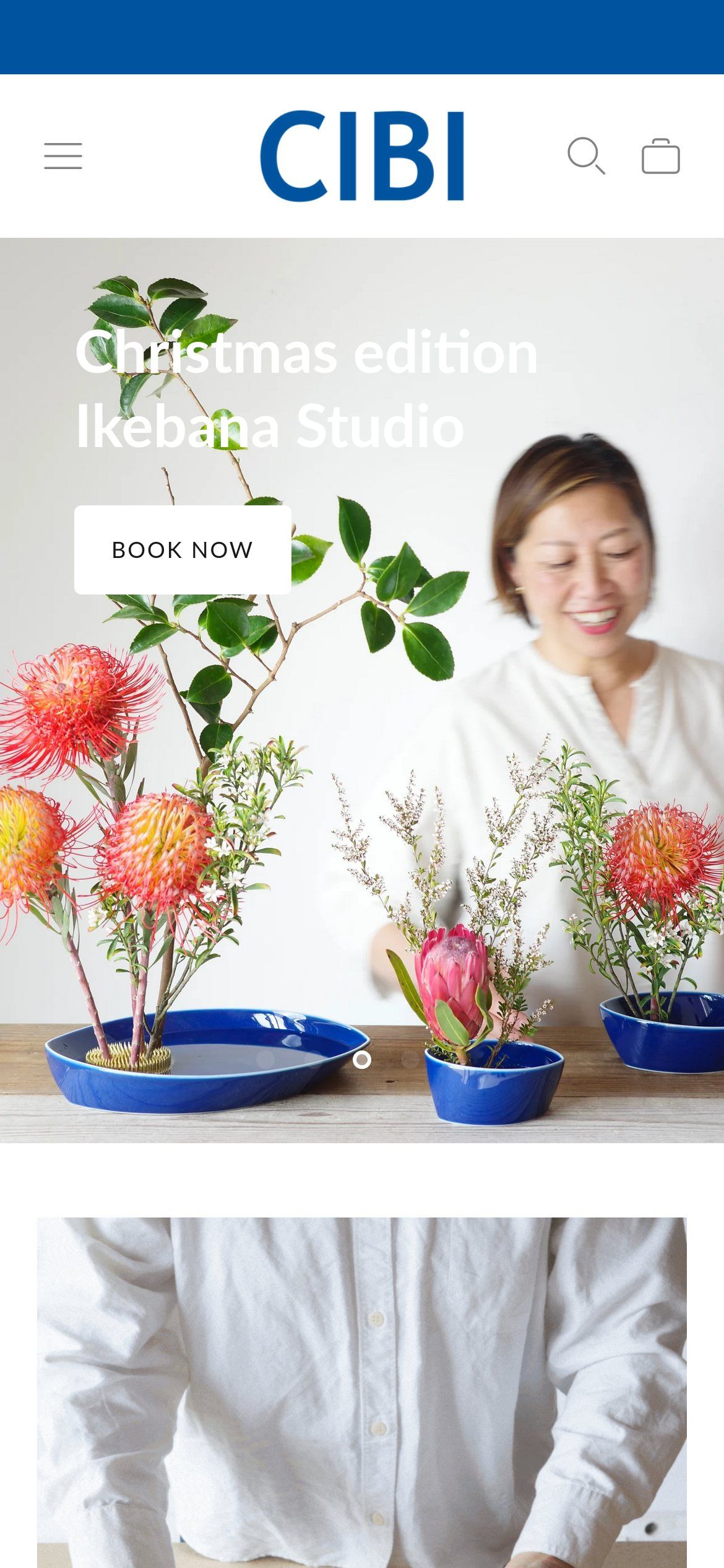
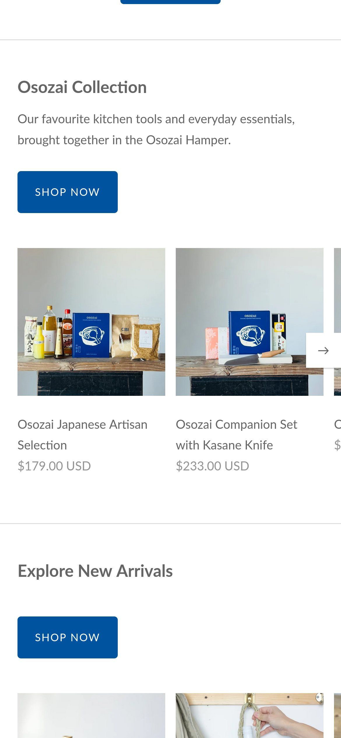
Phones first
Every template was rebuilt to work properly on mobile, where most visitors arrive.
- 03
Faster everywhere
Lighter pages, properly sized images and fewer third-party scripts make browsing feel immediate.
- 04
Let the objects speak
Editorial layouts give products and exhibitions room, so the site sells the way the store does.
Outcome
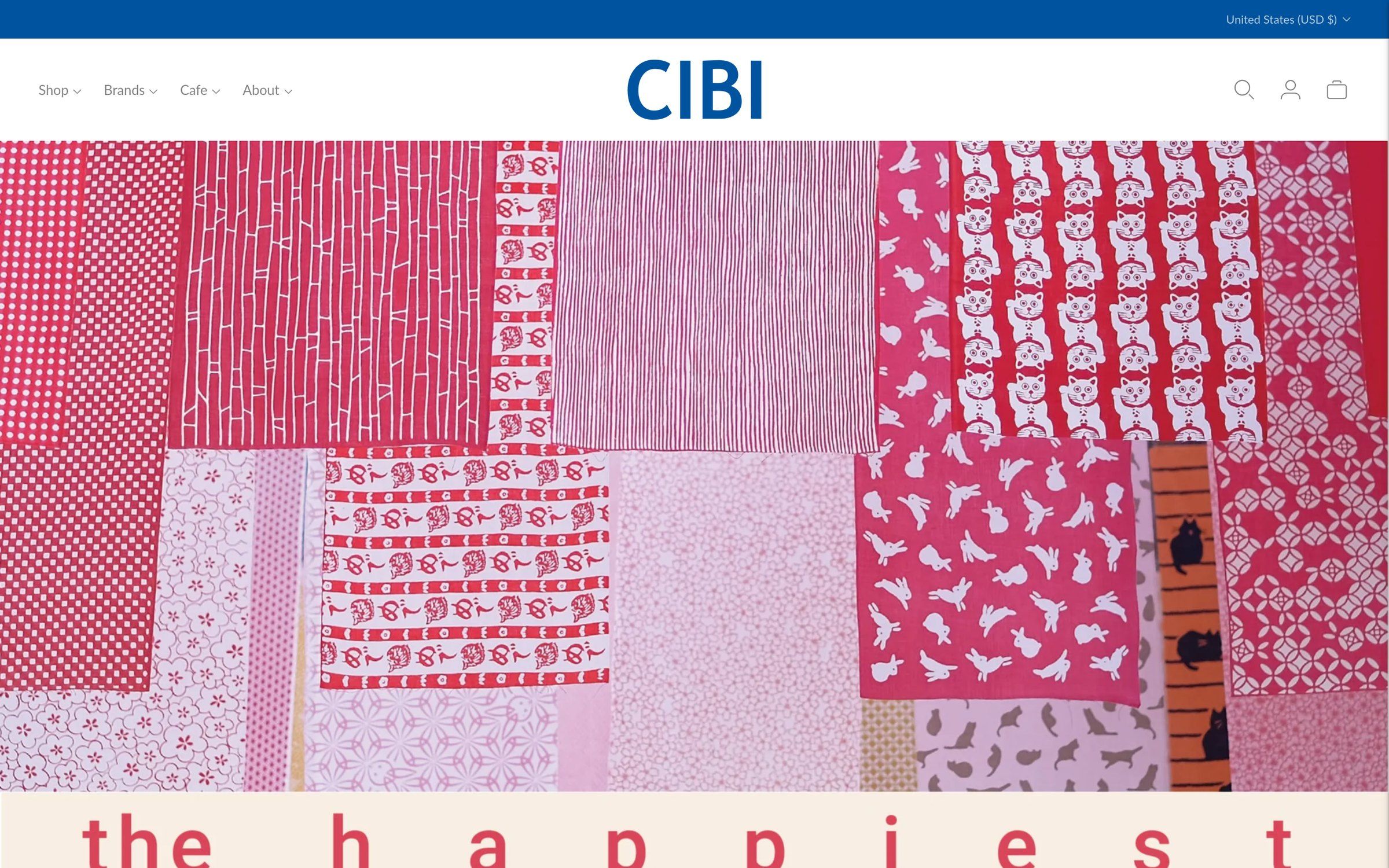
The site now loads noticeably faster, works properly on every phone, and finally looks like the business customers know in person.